Wednesday, 26 September 2012

Storyboard: Initial Ideas

S T O R Y B O A R D


As I have decided to go with the "Exploration" approach, I want to work
both under water, and above water. Perhaps looking at how the two different areas compare
in terms of lighting qualities, shadows, and form.
1.

I could begin the movie on the bottom of the ocean, exploring the shadows, 
and interesting lighting that the water casts on the model. Keeping
very low to the ground, I would then like explore the base of the model.

ANIMATION: In terms of animation, I would like to use lights, and animate them. Having different
forms of lighting moving around the ground. I want to do this as it would change the types
of shadows and lighting that I would get. 

I could perhaps begin the movie in blackness, and have just a single light, or glowing object float past the screen. I could then follow this light, where my model would then be revealed. 


2.

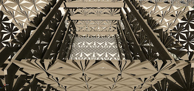
As my model lends itself to the idea of travelling through a tunnel, I want to travel upward
through the center of my model, with a view similar to the above. 

ANIMATION: As I am travelling up through the model, I would perhaps like to animate the entire
model itself, perhaps emerging from the water, as I do. moving upward as I do. If done correctly, this could look really amazing as I exit the water's surface.  


3.

I would then exit the water's surface and continue upward through my model out of the water.
I would continue this until I reach the top of my model.

ANIMATION: Once exited the water, I would like to have some separate "wall objects" that would be positioned between the sun and my main model. The purpose of these "wall  objects" would be to 
manipulate the types of shadows, and shaped of shadows that would be cast on to my model. I would like to animate these, and as they move, the shadows would change and evolve in a very interesting way.


4.

Next, I would like to explore the top of my model, looking at the shadows, shapes and 
lighting on this area of the model. This would be similar to the beginning, where the same was done but on the oceans ground. 

ANIMATION: At this point, I would quite like to continue animating the "wall objects" and continue to play with the types of shadows that this can create. In the type of view that I have above. I would also like to try and animate the wooden plank parts of my model. Perhaps trying to have them break up. shatter, move, or something similar. 


POSSIBLE ENDINGS:

  • Have my model sinking back in to the water. 
  • Could have the day turn to night and end in complete darkness
  • Have a single glowing object take me back down in to the water, and then have the glowing object leave further and further in to the distance. 


Monday, 24 September 2012

Animation!


Now that it is time to start learning how to animate, I have decided that my model is too simple, small and uninteresting to animate as it is. I started to play around with repeating the model on top of each other, and came up with this


I think that this is a really interesting viewpoint and has got me starting to think of some different ways that i could animate my model. The really great perspective view that my model now gives has given me the idea of animating the model in a way that would explore these long spaces. Perhaps lights could be used to travel up and down through the spaces. I could also perhaps replicate this model yet again, and have it beneath the water's surface and explore the model in the water, and above. 


SPAWN POINT:

 Below is an image showing the creation of my spawn point.


100 Word Explanation / Design Intention

Going forward in project 2, I plan to focus my final animation on exploring my model using lighting. I would like to direct the viewer to the intended animation using purposefully placed lights. Though the bulk of my model may not lend itself well to intense animation, I believe a more delicate and simple form of animation would work best to match the delicacy of my model. There are extruding sections in my design that could look quite effective when animated, perhaps sliding away, and toward my main model. After exploring with weather, I love the rain when used with my model, though this is just an idea at this point.

Wednesday, 19 September 2012

More Experimentation

After considering what was suggested at the Interim Critique,
I started playing around more with some different things such as the environment, including rain, 
weather, tornados etc. I also introduced water in some of the shots, and explored
my model a lot, further experimenting with different lighting. This way, could find some really interesting different angles.


In this image, I was trying to play around a lot more with some more subtle
light sources and also finding a more interesting angle that shows off my model 
a bit more.


This image shows more experimentation with lighting. Here I used lights
that were coloured black. This created quite an interesting effect as it seemed
to really enhance the shadows, and exaggerate all of the shapes and the 
form of my model.


Here I began playing with the environment. Experimenting with rain, along with the 
reflective qualities, Puddles sizes, and rain strength, I was able to come
up with this image. I really like this look, as it creates a very dark and moody
atmosphere. I also decided to remove all of the lighting so that the reflective qualities 
become the main source of illumination. This draws more attention to my model and
also creates a really interesting image.


This image just shows me playing around a bit more with the environment and weather.
I inserted a Tornado, just as means of experimenting. Even though I didn't really think that 
it done anything special for my model, it was still quite interesting.


Here I decided to start manipulating the model itself a little more. Rotating it, along with the 
addition of water to try and put a new spin on things. Here, I was able to make my model
look as though it was some sort of wreckage, submerged in to the water. I think that
this is a really successful shot.


Interim Critique Session

After showing my three images at the interim critique session, I got 
some great advice about some new things that I could try, along with
what worked, and what didn't.

What worked:

  • The model was working well. It looked good in CryEngine
  • The shadowing and how I was playing with the time of day, and how the sun position changed what the image was like.
  • The lights - As I had been experimenting a lot with different light colours and strengths, this was working well in my models.

What did not work:

  • Two of my views weren't as strong as the other. Moving around in my model, circling around it and exploring can lead to some interesting views.

Things to Try:

  • Water - Another student suggested that my model may look good when in water. Perhaps trying some under water views, or even at water level could make for some really interesting images. 
  • Getting inside my model and having a good look around. This is a way that I can find new and interesting viewpoints and images.

INTERIM SUBMISSIONS !

 After playing around some more in CryEngine, I came up with
3 interesting images for the interim critique for Assessment 2:


In this image, I was really focussing on trying to manipulate the light,
and really trying to fully control the mood through the lighting. I experimented 
a lot with different lighting positions, radius', brightnesses etc until I got to this 
point. I really like the dark, moody, space like feel and think that I 
have well demonstrated a strong control of lighting in CryEngine.


In this image, I was trying to use texture, daylight, and shadowing to come
up with a really interesting image. By experimenting with the time of day, sun direction,
and the north and south pole settings, I was able to manipulate the sun un to creating
the shadows that I wanted. 


This image was all about experimentation for me. I played around a lot with
the coloured lighting, along with all of the glowing functions to try and come up with something really surreal and interesting. I also began experimenting with changing 
the settings of existing features, such as the moon. Here I have altered the colour of the moon, giving the image a far more surreal and space like feel to the model, which I really like. 

Developed 3D Model

Although the model that I was using in CryEngine seemed to be working
alright, I just wasn't really happy with the way it was looking. It looked a little
messy and unattractive, so I decided to try and develop it a bit more in sketchup, 
try to come up with something I was a bit more happy with.


This is the model that I finally came up with. It has come from my original 
"Rhythm" model from the first assignment. I have used some repetition, and used 
4 separate versions of the original model, to create a more complex and interesting
Model.


Here you can see the 4 copies of the model that I have used. This 
angle also shows another development that I decided to go with, being the 
strips that are coming outward from each section and interconnecting / passing
through each other.


Here you can see the way that the strips / sections cross in between each other.
I really like this part of my model and think that it works really
well to connect the model and keep it looking united and as one. 


Above: Original RHYTHM model where my development has come from.


Monday, 10 September 2012

P R O J E C T # 2


This is a developed model from project one. Though it may  not
b the model that I want to use for the remainder of the project, it is a good
model to start playing with in CryEngine.


I managed to import the model in to CryEngine! Started playing with different lighting and 
shadows, time of day etc.


Here I started playing with the addition of lights and also coloured lighting
and using them in different parts of my model to enhance the visual appearance. 


Sunday, 2 September 2012

Model Sketches - Project 2

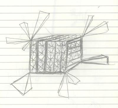
Here are the five developed model sketches. They have all come from my "Rhythm" model from 
the first project and are mostly abstract. For this project, I want to try and avoid creating literal 
spaces, room, buildings and structures etc - keeping this in mind, I have sketched these 
developed model ideas.

As this was the most delicate and small models from my first project, I would really like to develop it in a way that makes it large, and structural.